Case study
Indochino
Rebuilding the path from browse to buy: navigation, product discovery, and the fabric sampler that closes the one gap online shopping can't solve on its own. You can't feel wool through a screen.
- Role
- Digital Product Designer
- Focus
- eCommerce UX · Conversion
- Timeline
- 6 months, 2025
- Team
- Me + 2 PMs, Indochino, in-house dev
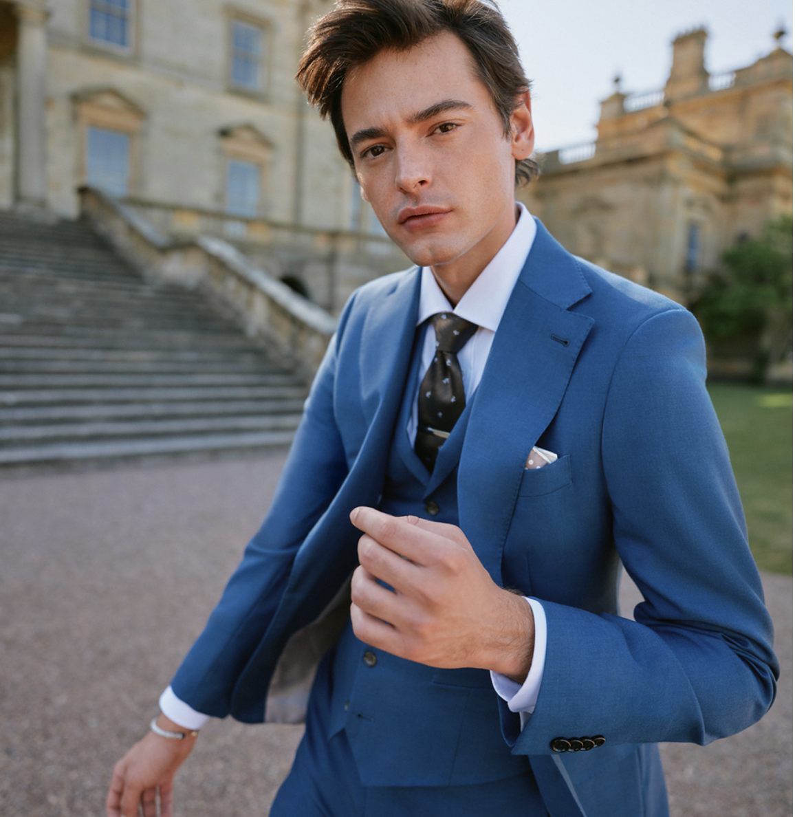
My role
I led UX and interaction design across this funnel: navigation, the product listing page, product pages, and the Tailor's Kit builder. I worked directly with two product managers, Indochino as the client, and their in-house development team on implementation. Content and copywriting were owned by Indochino's in-house team; I designed the systems that content lived in.
Indochino sells suits customers can't try on. Every step between first browse and checkout has to build enough confidence to close that gap on its own, or people stall out before they ever commit.
This case study follows four connected surfaces along that path: navigation, which routes people toward the right starting point; the product listing page, where browsing turns into intent; the product page, where intent has to survive contact with the actual decision; and the Tailor's Kit, the fabric sampler that gives people something to touch before they buy. Each stage was designed to hand a clearer, more confident customer to the next.
One nav, wildly different intents
Users arrived with very different goals: wedding shopping, casual browsing, people who already knew exactly what they wanted. The navigation didn't distinguish between them. "Get Started" in particular left people unsure whether it led to shopping or education.
What testing actually showed
Method: unmoderated tree-test prototype testing via Userlytics, ~10 participants, comparing the current navigation against a clickable prototype on tasks like finding products, finding brand info, and correctly interpreting relabeled links.
Two assumptions didn't hold up: no one noticed "Shop By Color" even when prompted to shop for a blue suit, and Sale, no longer a Tier-1 link, became noticeably harder to find, with users searching the PLP for deals instead. On mobile, the hamburger menu's hit target was too small for several users, while the quick menu links outperformed expectations. Wedding as a Tier-1 link worked as intended. Testing also surfaced a gap the plan hadn't anticipated: people expected the Wedding Guide to live on wedding-specific PLPs, not in navigation.
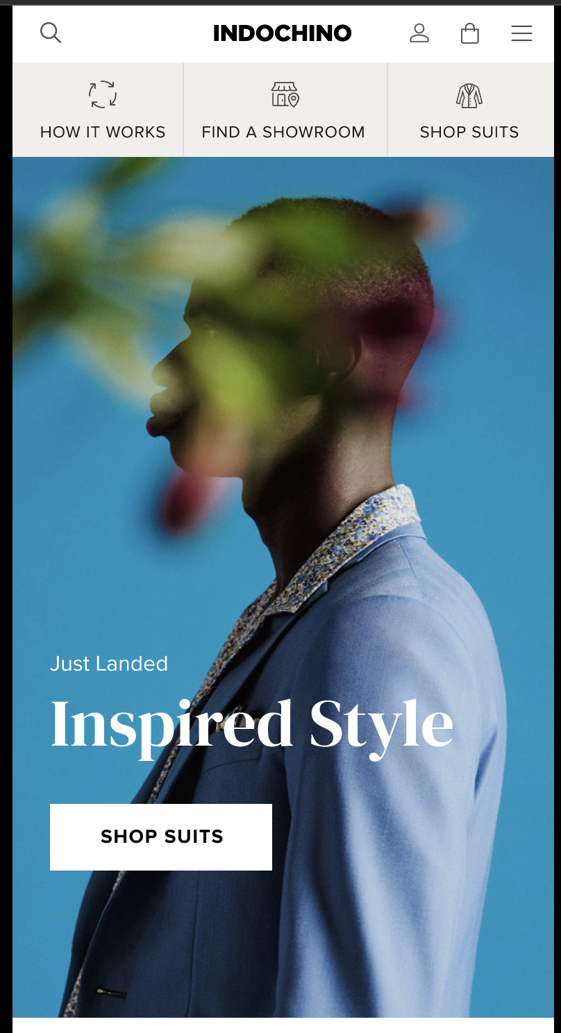
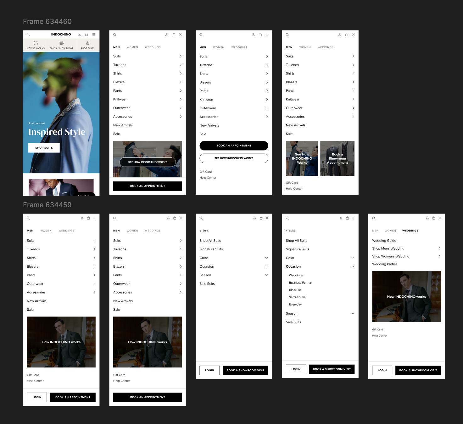
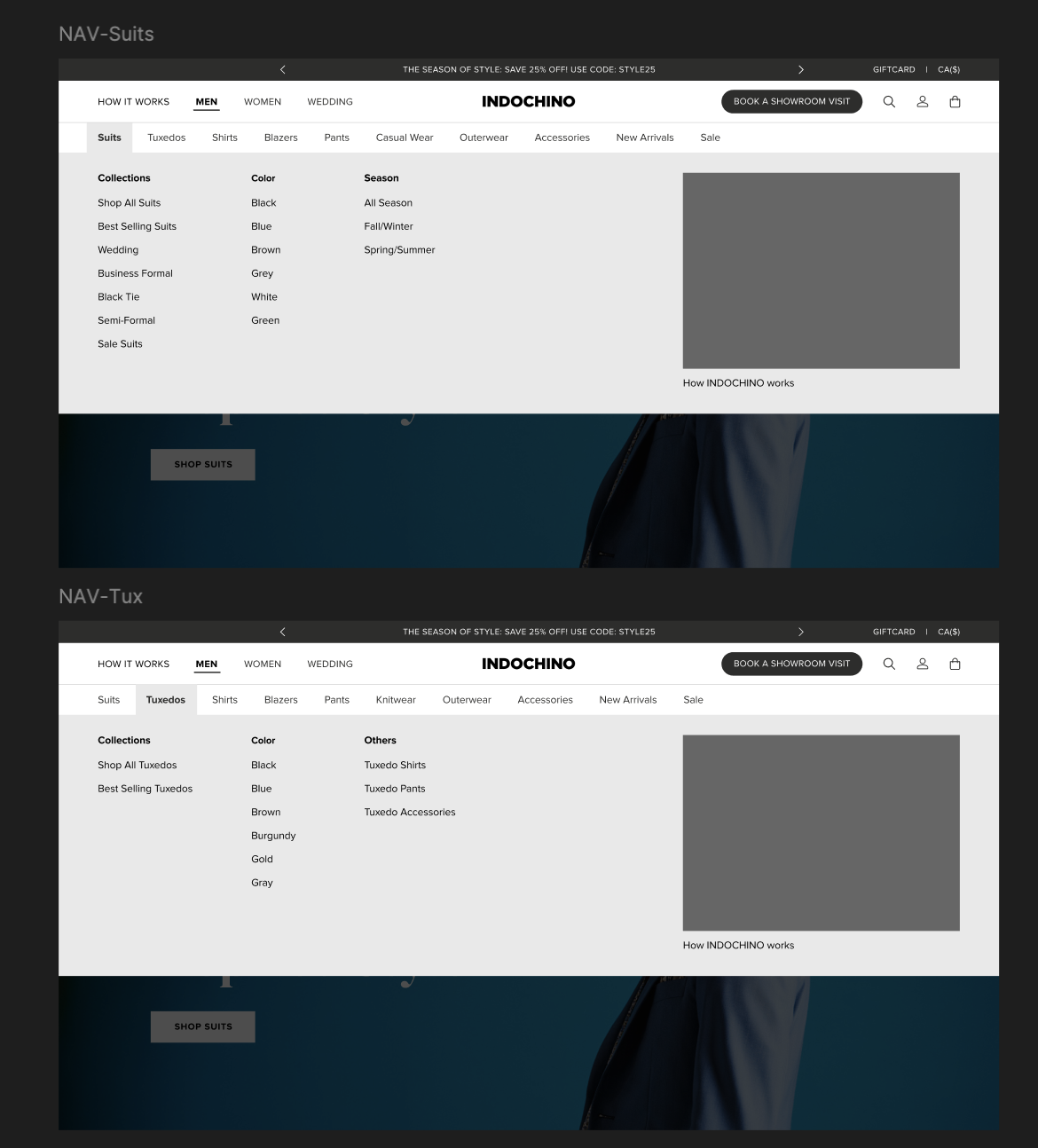
Redesigned around intent, not category
The shipped nav reflects that directly: a PLP-level sale filter, a Wedding Guide CTA on wedding PLPs, a text-based Wedding Guide link on mobile in place of the image CTA, and a larger mobile menu target. All of it built around what people were actually trying to do rather than category structure.
STOP 2 : PRODUCT LISTING PAGE
Closing the gap with the rest of the category
Before redesigning a single filter or tile, we needed to know exactly where Indochino's PLP had fallen behind what shoppers already expected elsewhere.
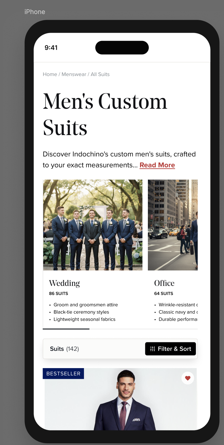
A PLP that hadn't kept pace with the category
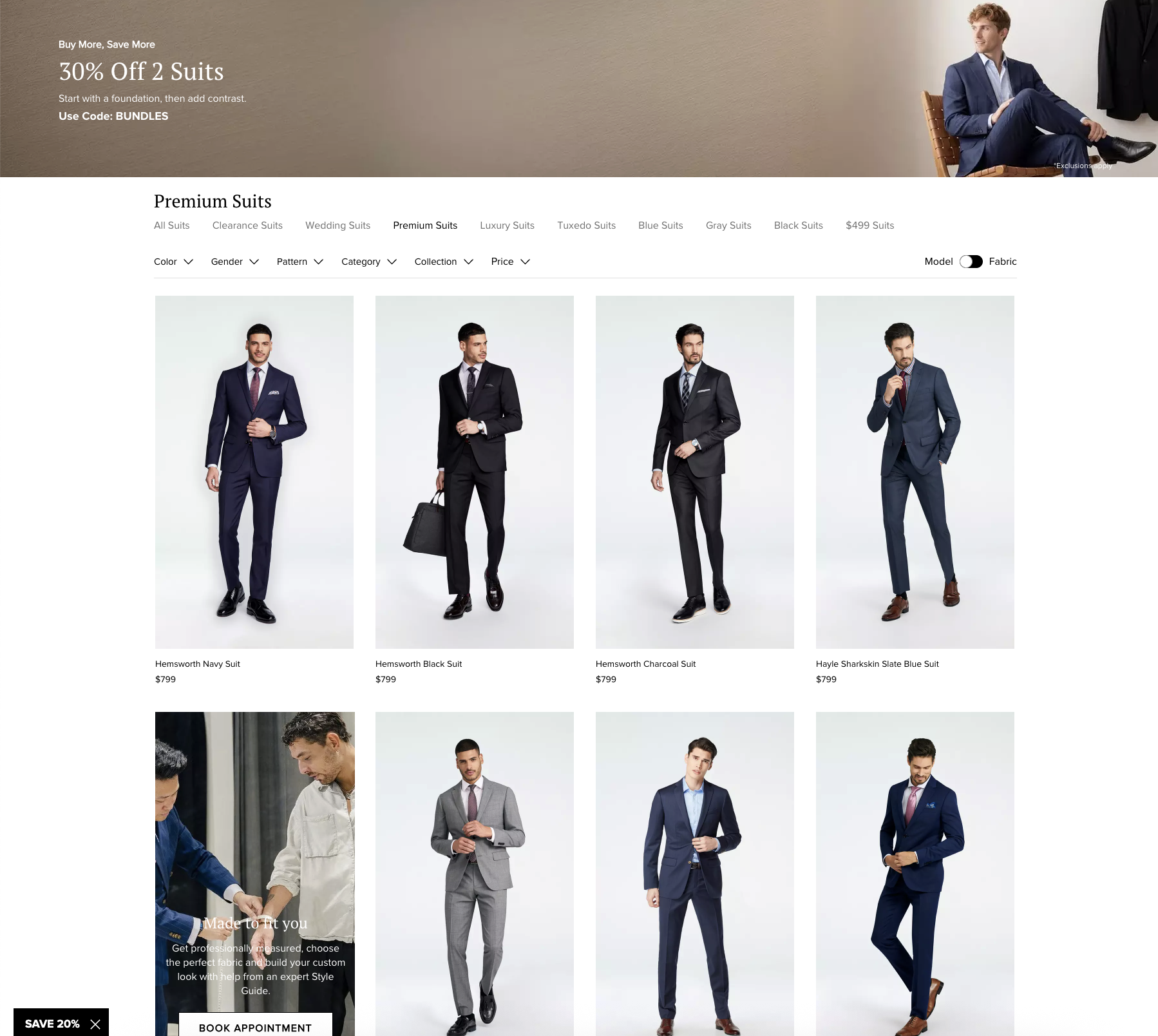
Product listing pages are where browsing turns into intent. The tile itself has to do most of the selling before anyone clicks in. Indochino's existing PLP led with a heavy hero section, used a fragmented filter pattern instead of a single drawer, and its product tiles carried none of the shorthand (color swatches, badges, quick-shop) that shoppers had already learned to expect from other sites.
The original PLP
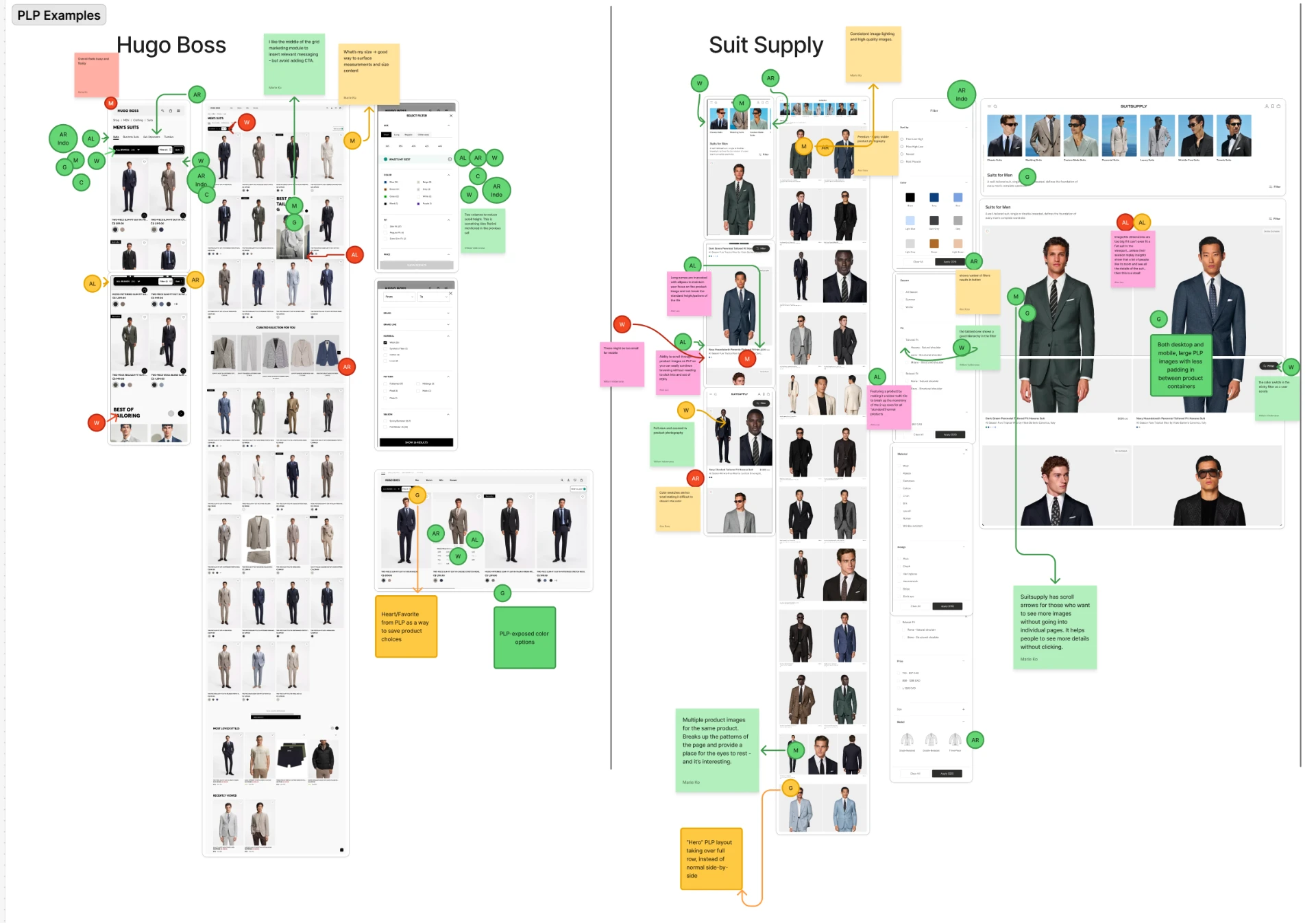
What seven competitors were already doing
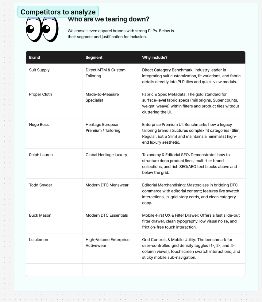
Method: a structured teardown and SWOT analysis across seven apparel brands with strong PLPs, each chosen for a specific reason: Suit Supply and Proper Cloth as direct made-to-measure competitors, Hugo Boss and Ralph Lauren as heritage and luxury benchmarks, Todd Snyder and Buck Mason for modern DTC merchandising patterns, and Lululemon for high-volume grid and filter UX at scale.
Clear patterns emerged across all seven. Nearly every competitor used a single filter/sort control that expanded into a drawer, which wasn't how Indochino's filters worked. Every one showed color swatches directly on the product tile, layered badges like "new" or "bestseller" onto the image, and most offered quick-shop or quick-add-to-cart on hover. The made-to-measure brands were the only ones *without* hover quick-shop, which reads as that omission tracking with the MTM model itself rather than a gap worth copying. Most competitors also skipped a heavy hero section entirely, moving straight from the page header into product tiles.
Closing the gaps that actually mattered
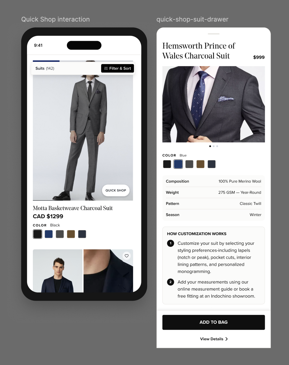
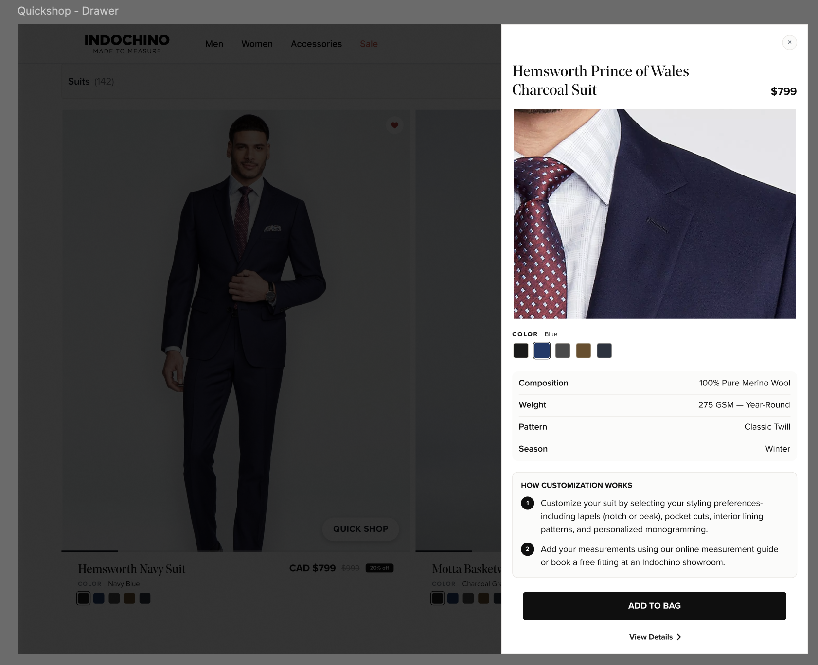
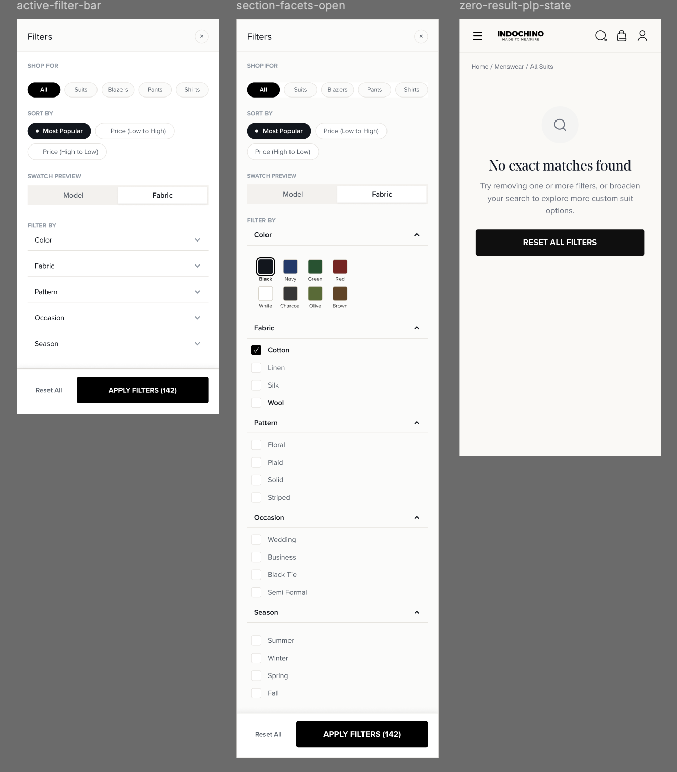
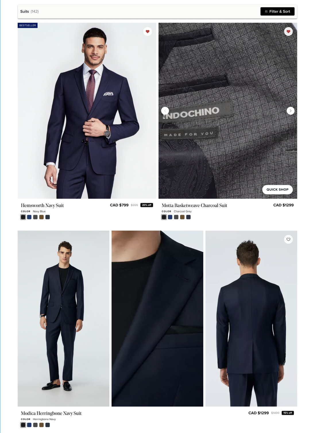
The teardown turned into a specific list of changes: standardizing product tiles with badges, strikethrough pricing, scrollable hover images, and color swatches; adding visual treatment to subcategory links instead of text-only; consolidating filters into a single drawer with sorting built in; removing the heavy hero section to get people into product faster; and adding a favorite capability.
STOP 3 : PRODUCT PAGE
Making the MTM-vs-off-the-rack decision legible
Where intent either survives contact with the actual decision, or doesn't.
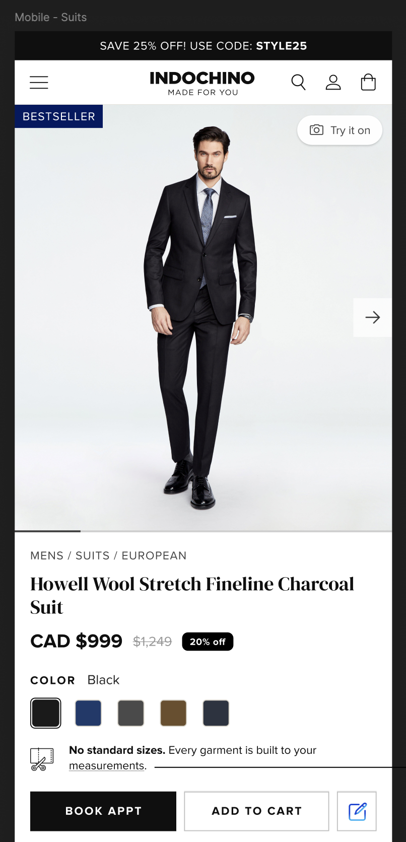
Two purchase paths, tangled into one dense page
Customers struggled to understand how made-to-measure differed from off-the-rack, and dense product pages left the “buy online” and “book a fitting” paths tangled together.
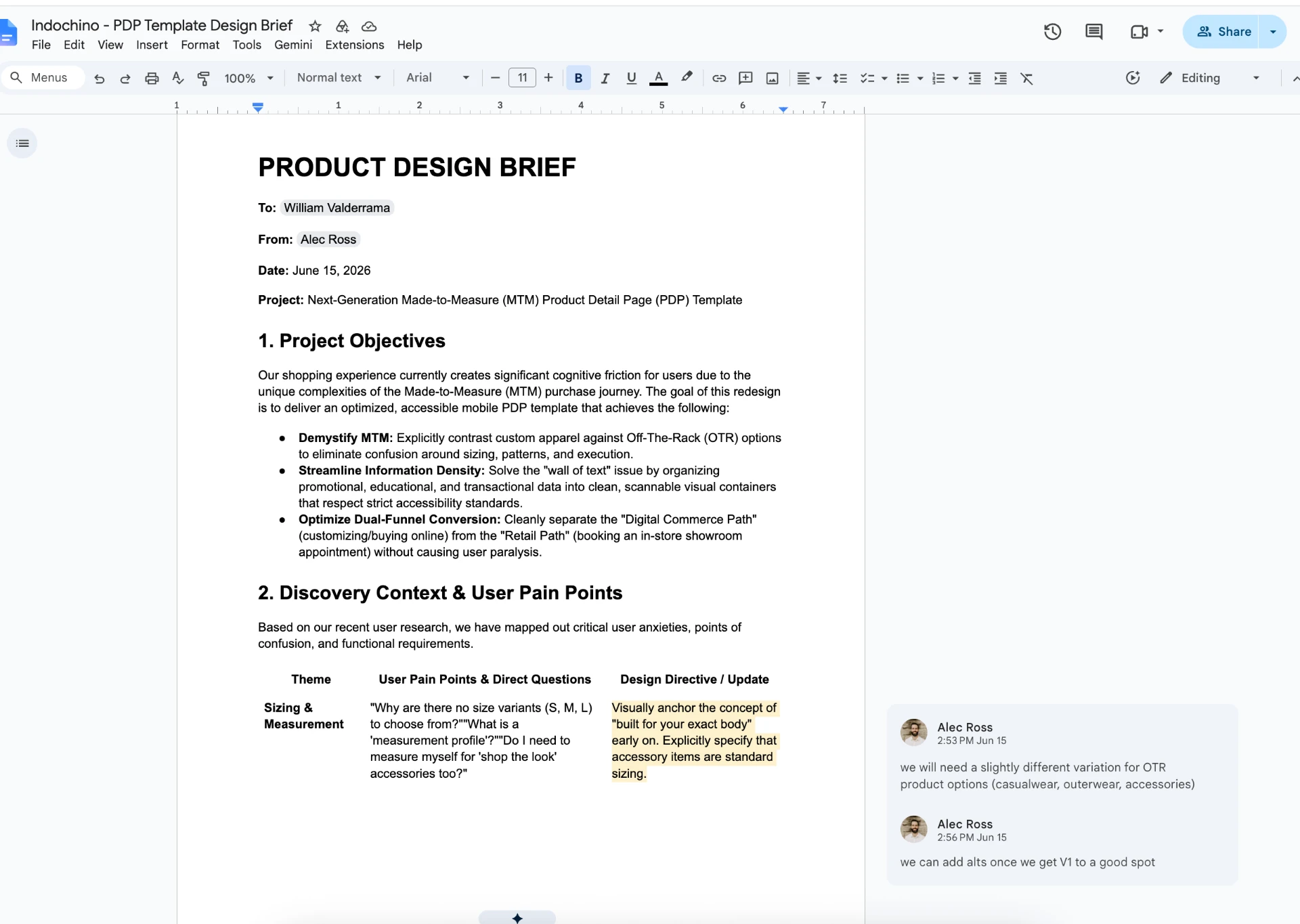
What the brief actually asked for
Input: a written brief from my PM outlining the need to separate the made-to-measure purchase path from off-the-rack browsing and make the two easy to tell apart at a glance.
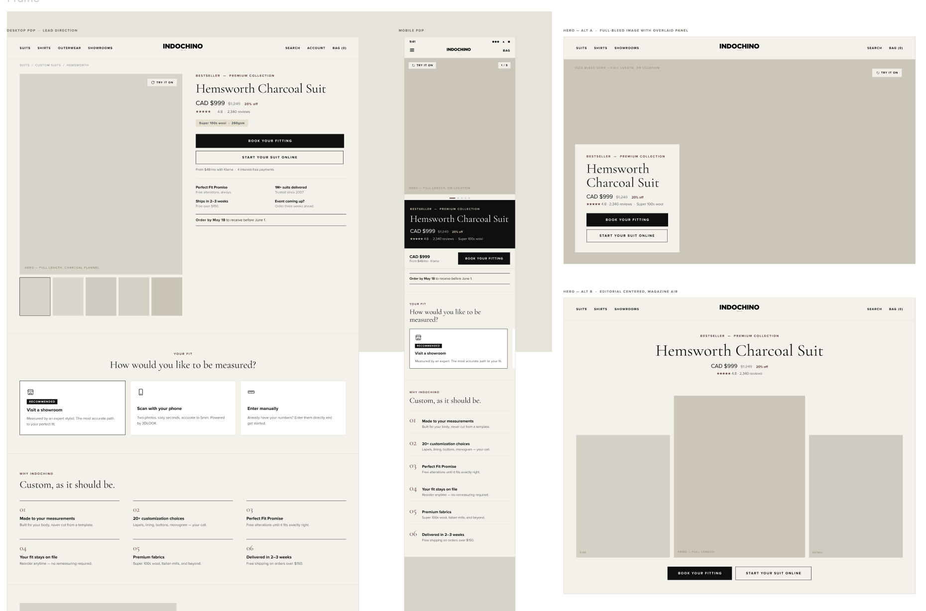
Agent-generated variations, refined with the client's in-house designer
I gave Figma's agent the brief and had it generate a first pass of variations rather than starting from a blank page. I took the strongest direction and sent it to Indochino's in-house designer, who reviewed it with their dev team for technical feasibility and brought back feedback on what was and wasn't realistic to build.
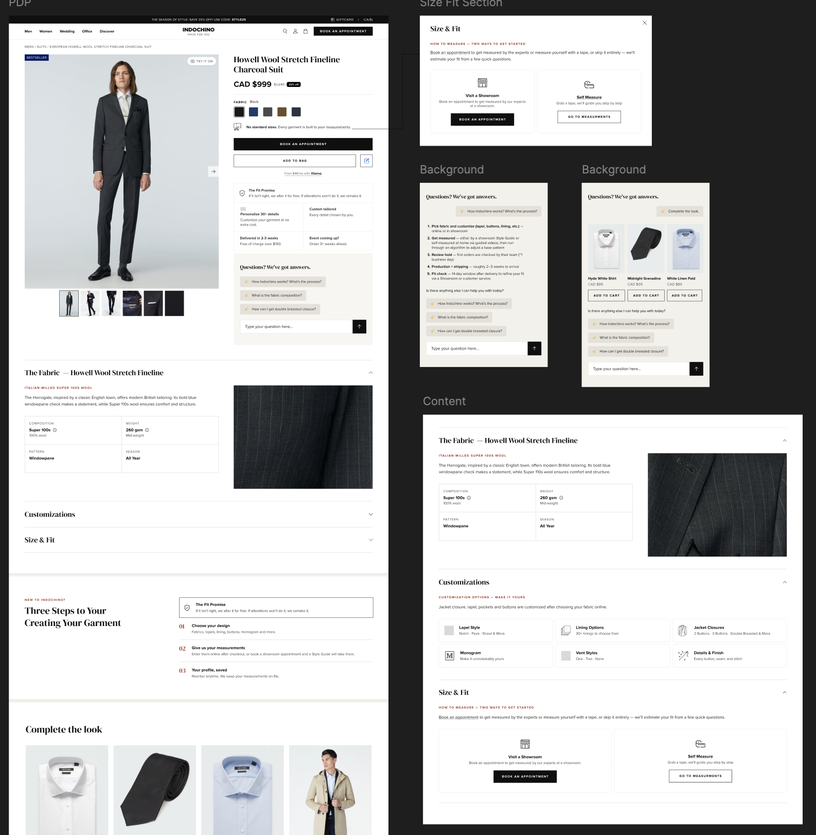
Split, scannable, and specific
Restructured into scannable containers with an explicit made-to-measure-vs-off-the-rack comparison and a clean split between the two purchase paths.
STOP 4 : WHERE THE FUNNEL CLOSES
The Tailor's Kit
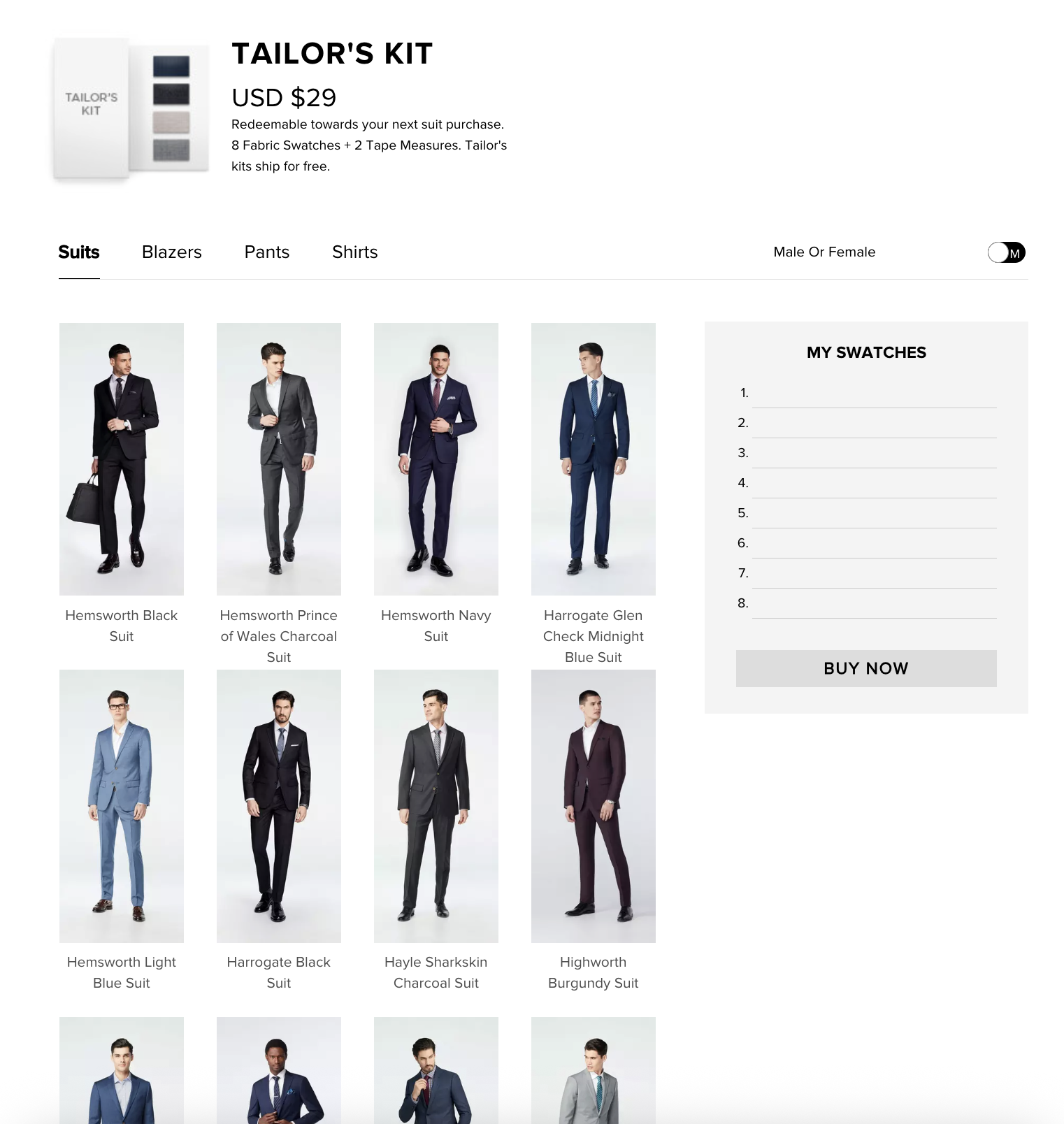
Eight fabric swatches and two tape measures, shipped to your door for $29 and fully credited back on a suit. The kit closes the biggest gap in buying a suit online: you can't feel wool through a screen.
The tactile gap was costing conversions, and the page made it worse
Online suit shoppers can't touch or feel fabric before buying. That hesitation shows up as lower conversion and, downstream, as higher return and remake rates. The existing Tailor's Kit page should have been solving that. Instead it introduced its own friction: an endless-scroll swatch grid with no filtering, and a modal that buried the $29-credit messaging exactly when people needed it most.
What the brief actually asked for
Input: a written brief from my PM outlining the $29-credit mechanic and the 8-swatch goal, against a hard two-week deadline, with no dedicated research or testing phase built into the timeline.
The mechanic was specified; the interaction model wasn't. That was the open question I had to answer: how do you move someone from an unfiltered wall of fabric to eight selected swatches at checkout, without a page that either overwhelms with choice or interrupts momentum with a modal, while keeping the $29 credit visible at the exact moment someone hesitates instead of disclosed after the fact.
Three agent-generated alternates, one clear call
Existing modules and components from Indochino's design system covered most of the page. For the net-new pieces (the swatch builder and selection drawer), I gave Figma's agent the brief and asked for three alternates, which let me evaluate real screen-level options inside the two-week window instead of spending that time on manual layout from scratch.
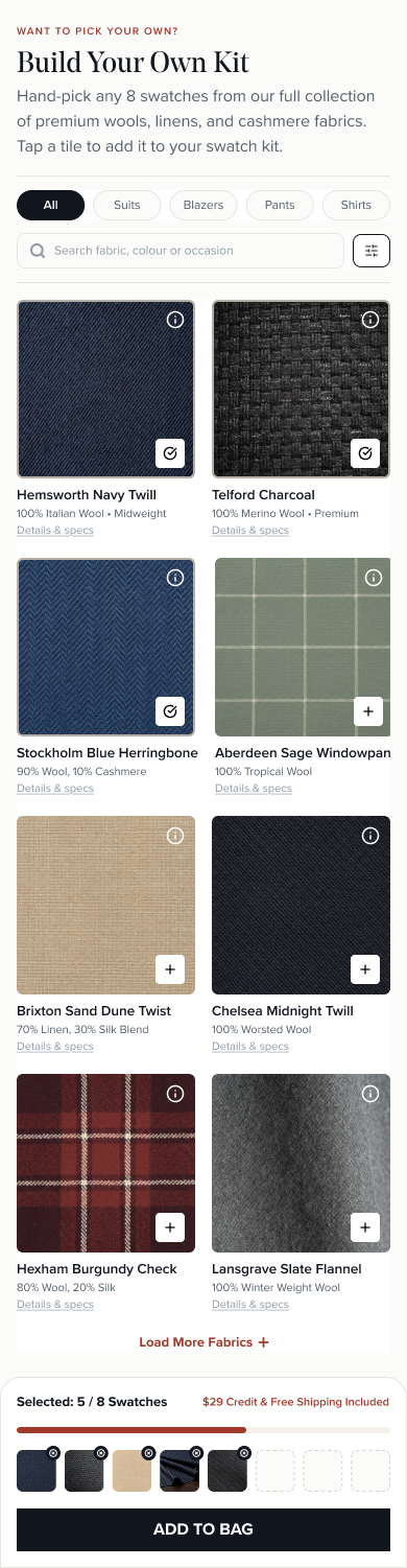
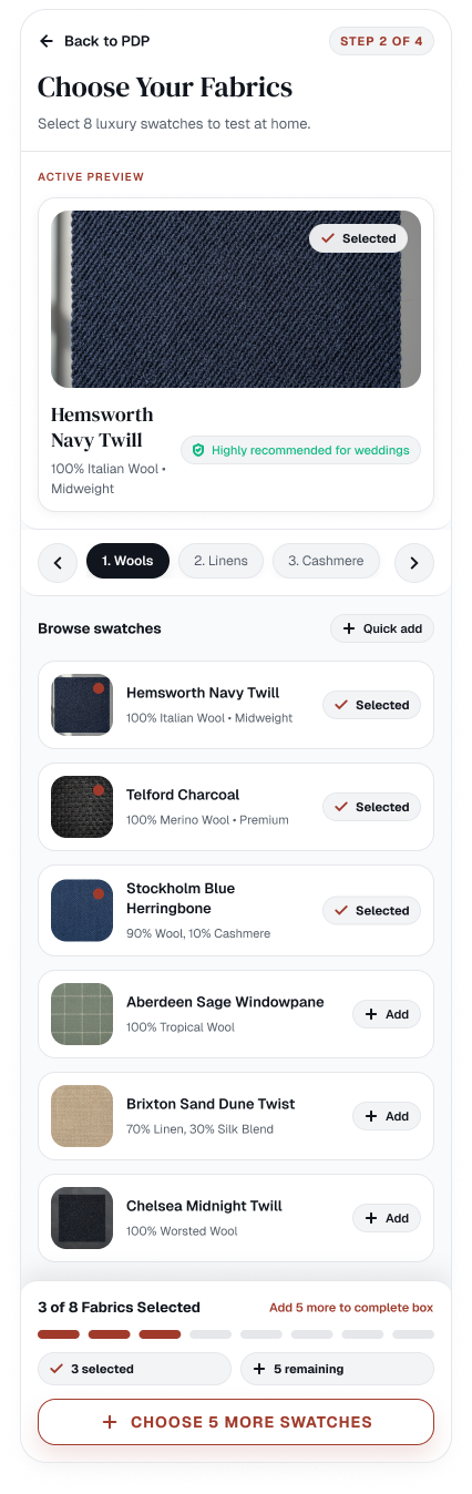
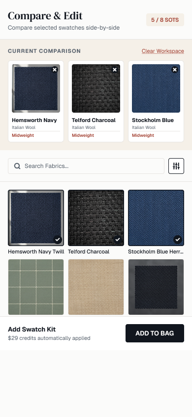
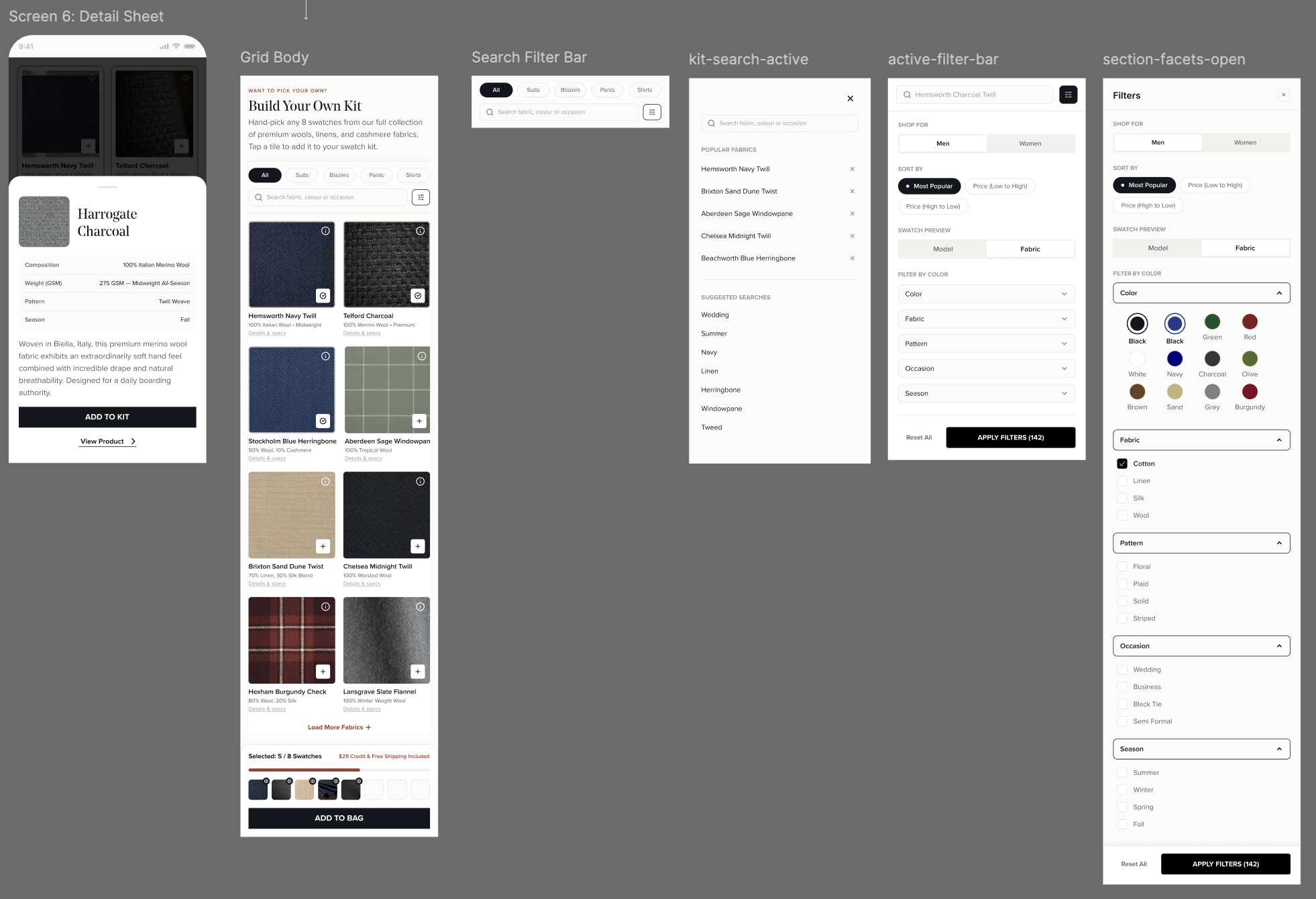
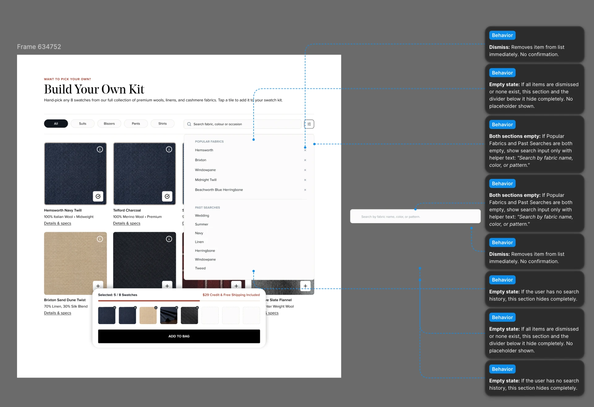
The reasoning: The three alternates represented different mental models for the same task. The guided version stepped people through one fabric category at a time behind a large active preview. It was controlled, but it forced a sequential flow even for someone who already knew what they wanted. The workspace version added a side-by-side comparison screen with full spec detail before anything got added to the bag. It was genuinely useful for a considered decision, but it introduced a second surface to manage for a task that didn't need spec-level comparison to complete. The version I shipped collapsed browsing and selecting into one continuous grid: filter, search, and add directly from the tiles, with a persistent tray tracking progress toward eight and keeping the $29 credit visible the entire time. No separate screen, no step to clear before the credit messaging showed up.
Evaluation criteria
I had the agent evaluate the three against one assumption: success meant more fabric selections and add-to-bag conversions. The shipped grid won on that basis — lower interaction cost from browsing, selecting, and buying on one surface; stronger information scent from visible names, colors, weights, and prices; and a persistent selection summary that kept the CTA in view the whole time. On mobile specifically, a continuous grid needed less scanning than managing previews, steppers, or comparison trays.
That trade-off was explicit, not incidental. The guided and workspace versions likely serve confidence, education, or complex comparison better. The grid was the stronger call specifically for speed, discovery, and conversion, which is what the brief was optimizing for.
The redesigned kit builder
Discovery & filtering : multi-faceted sorting by color, pattern, occasion, and season, so hundreds of options narrow fast.
1-click swatch builder : direct tile additions plus curated 8-swatch starter presets that remove decision fatigue entirely for people who just want a fast, good default.
Sticky selection drawer : persistent, real-time progress toward the 8-swatch goal, with the $29 credit visible the whole time, not buried in a modal.
Risk-free credit clarity : the credit is stated early and repeated at the moment of highest hesitation, not disclosed after the fact.
Status
This is currently in development and hasn't shipped yet, so there's no performance data to report. Once it's live, the two things I'd expect to move are kit-builder completion rate, since removing the modal interruption should reduce mid-build drop-off, and read-through on the $29 credit, since it's now surfaced continuously in the drawer instead of disclosed once inside a modal.
I'll update this case study with real numbers after a full cycle of post-launch data.
Outcomes
What this was designed to move
As an agency-side designer, I rarely get visibility into post-launch performance data directly. These are the signals each piece of work was built to move, not a confirmed results table.
- Nav findability
- Time to reach a relevant starting point, replacing the ambiguous “Get Started” path.
- PLP engagement
- Tile-level interaction (hover, quick-shop, favorite) following the competitor-informed redesign.
- PDP clarity
- Cognitive friction reduced by separating the digital-purchase path from the fitting-booking path.
- Kit builder completion
- Mid-build drop-off, following removal of the modal interruption.
Next Project
Borghese