Wholistic Matters
Site re-design and optimization for Wholistic Matters, mapping healthcare practitioner and nutrition enthusiast journeys into a modern, conversion-focused experience.
- Role
- Product Designer, VaynerCommerce
- Focus
- Site Re-design · Site Optimization · User Journeys
- Deliverables
- Design Conceptions, Journey Workshops, Design System
- Timeline
- 3 Months
- Team
- Brand, Marketing, Product
01
Context
While at VaynerCommerce, I led the re-design and optimization of the Wholistic Matters site — a platform serving both healthcare practitioners and nutrition enthusiasts with education, research, and professional-grade product information. The project was a focused, three-month engagement to redefine the digital experience for two distinct audiences.
02
Discovery
The site spoke to two very different audiences but treated them as one. Practitioners needed clinical depth, research, and practice-ready resources; enthusiasts needed approachable education and clear next steps. Neither journey was mapped, so content, navigation, and calls to action competed instead of guiding.
How Might We
How might we define the healthcare practitioner and nutrition enthusiast journeys, then rebuild the site so each audience finds its path — with a design system flexible enough to serve both?
03
Design Process
The project was structured around two tracks: product services, centered on a facilitated user journey workshop that defined each audience's goals and content needs; and design services, which produced up to three design conceptions before converging on a final direction and component library.
Key Areas of Focus
User Journey Workshop
Facilitated a user journey workshop to define the healthcare practitioner and nutrition enthusiast digital journeys — mapping goals, entry points, content needs, and friction across each audience before a single pixel moved.
Design Conceptions
Developed up to three distinct design conceptions exploring layout, hierarchy, and brand expression — giving the client room to react to real directions rather than abstract ideas, then converging on the strongest one.
Site Re-design
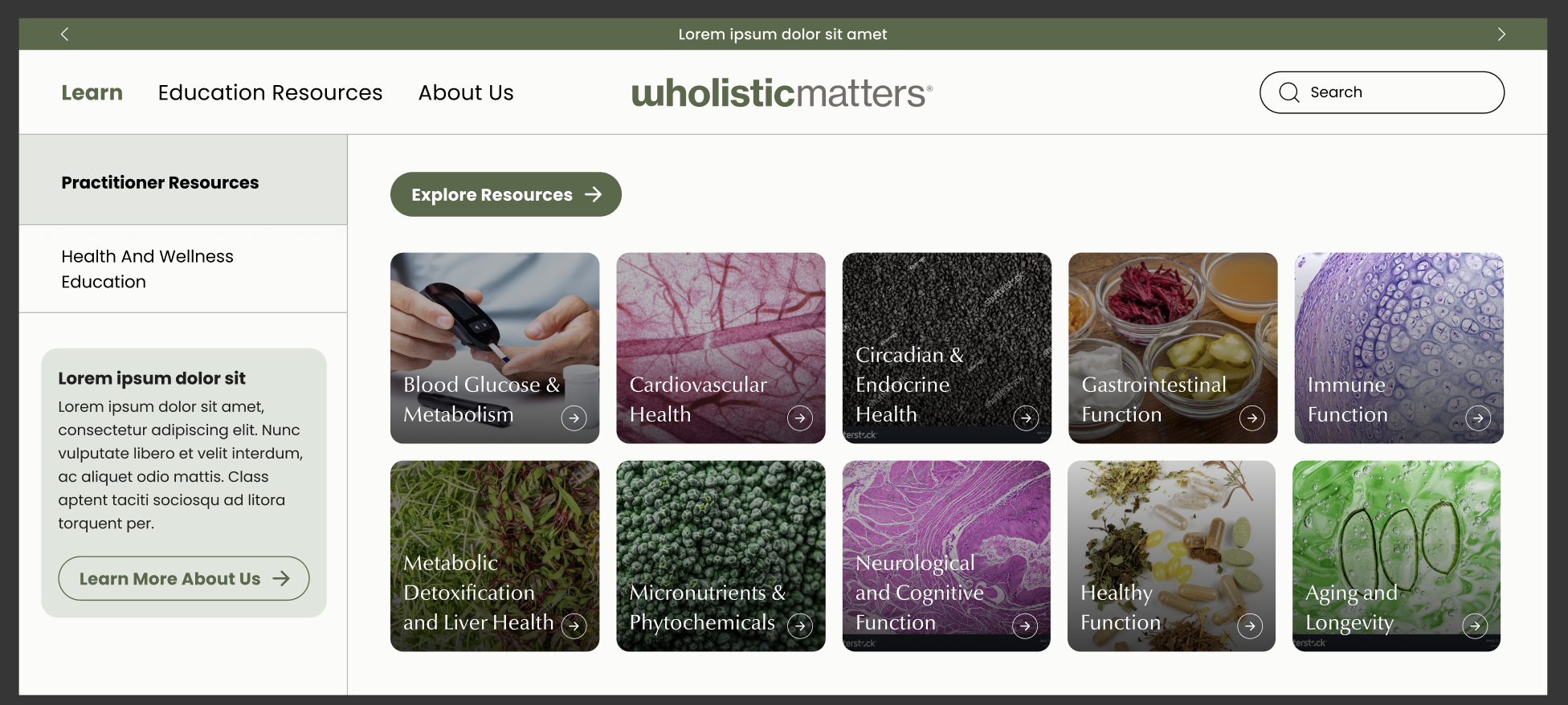
Rebuilt the experience around a clear information architecture: audience-aware navigation, modular content sections, and a visual system that translates the Wholistic Matters brand into a modern, credible digital presence.
Site Optimization
Tuned key templates for clarity and conversion — scannable content hierarchies, persistent calls to action, and mobile-first layouts that keep both practitioners and enthusiasts moving toward deeper engagement.
Design Considerations
- Serve two distinct audiences — practitioners and enthusiasts — without fragmenting the experience.
- Ground every layout decision in the journey maps, not preference.
- Explore multiple conceptions before committing to a direction.
- Build a reusable module library so future pages stay consistent.
- Keep the design system legible enough for a small internal team to maintain.
04
Design Conceptions
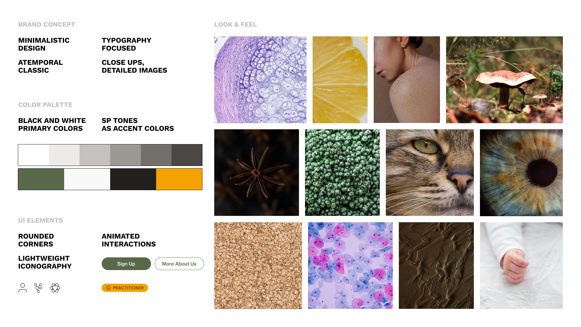
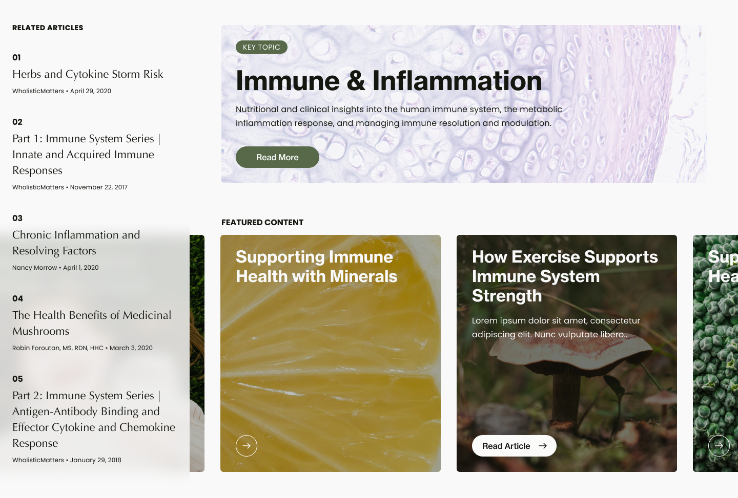
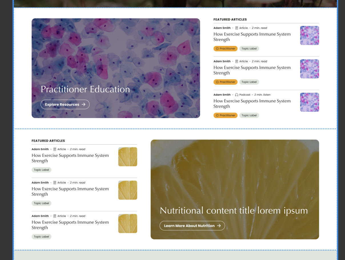
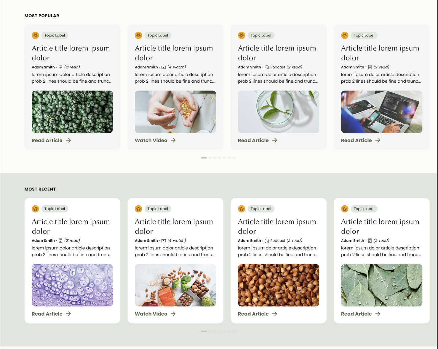
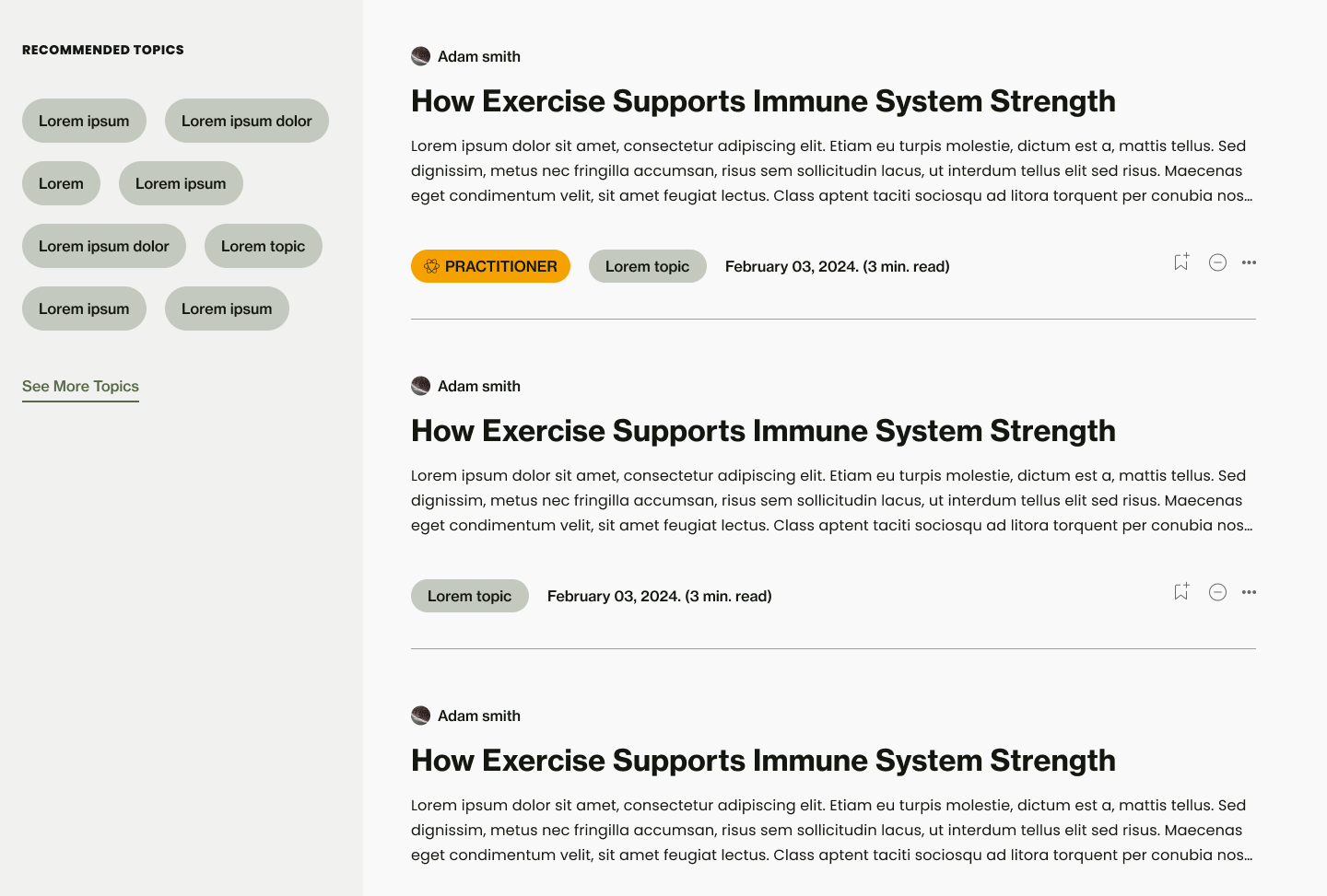
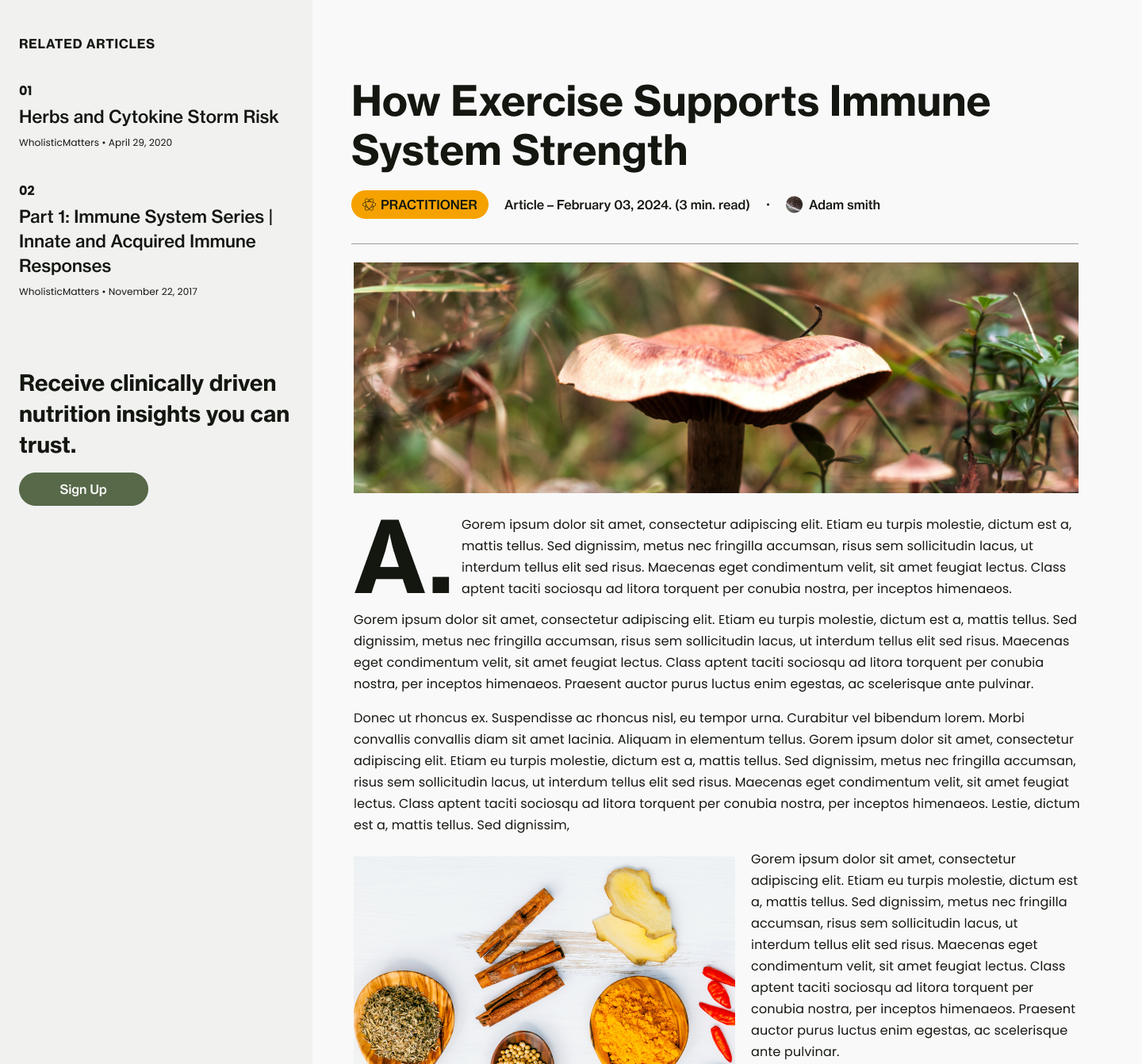
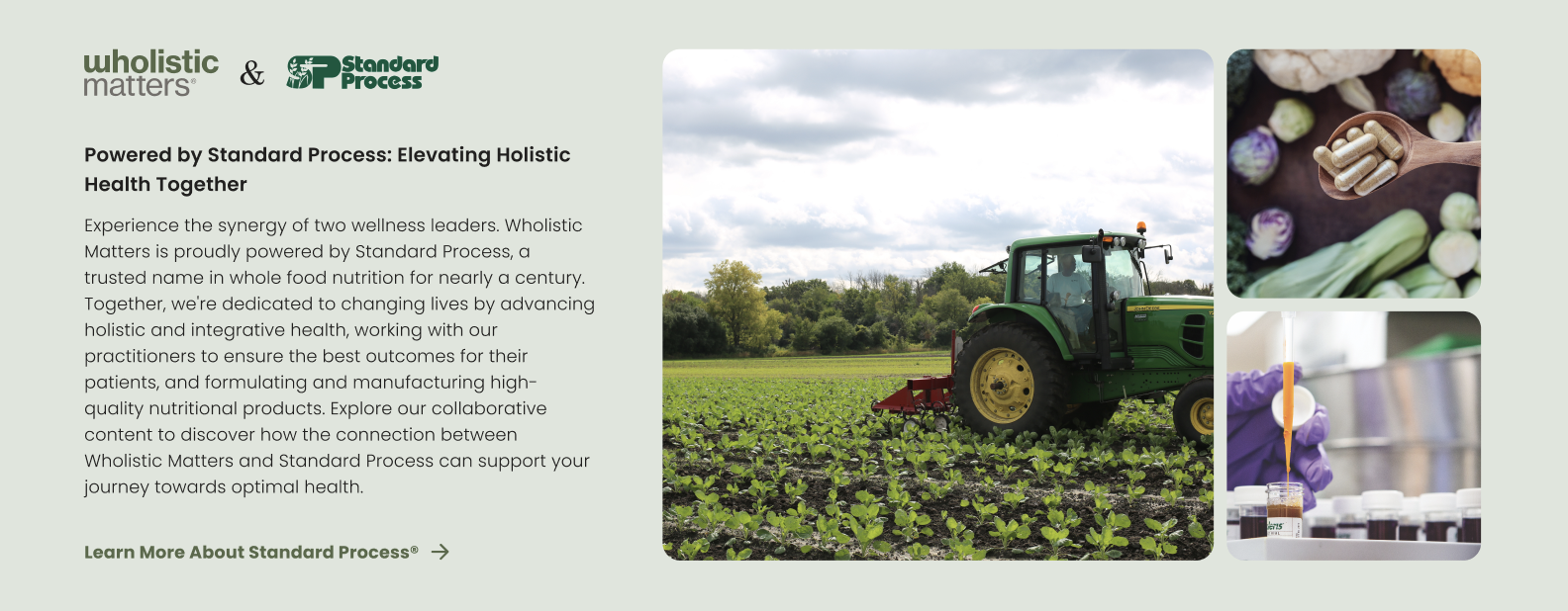
The chosen direction — "Wholistic Evolution" — is minimal and typography-led, with black-and-white primaries, a moss and amber accent pair, rounded corners, and close-up imagery. Templates were rebuilt around it: topic hubs, content feeds, article reading, and the Standard Process partnership story, each designed desktop-first and adapted for mobile.
05
Mobile Experience
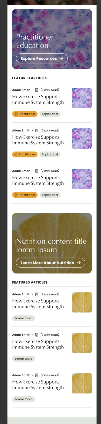
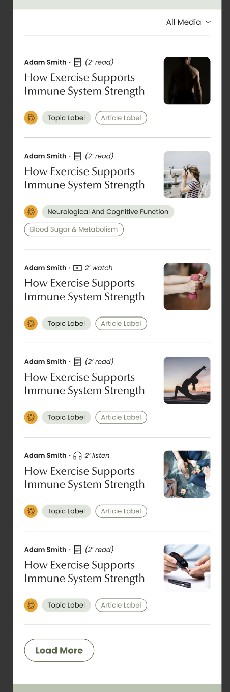
Mobile keeps the same hierarchy in a single column — practitioner-tagged content stays distinguishable, media types are labeled inline, and filtering plus load-more keep long libraries browsable on a small screen.
Next Project
Borghese